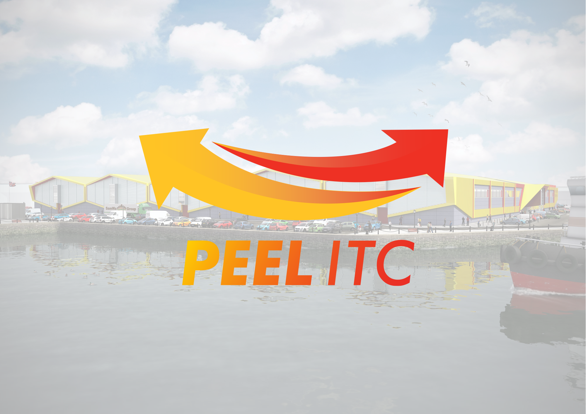
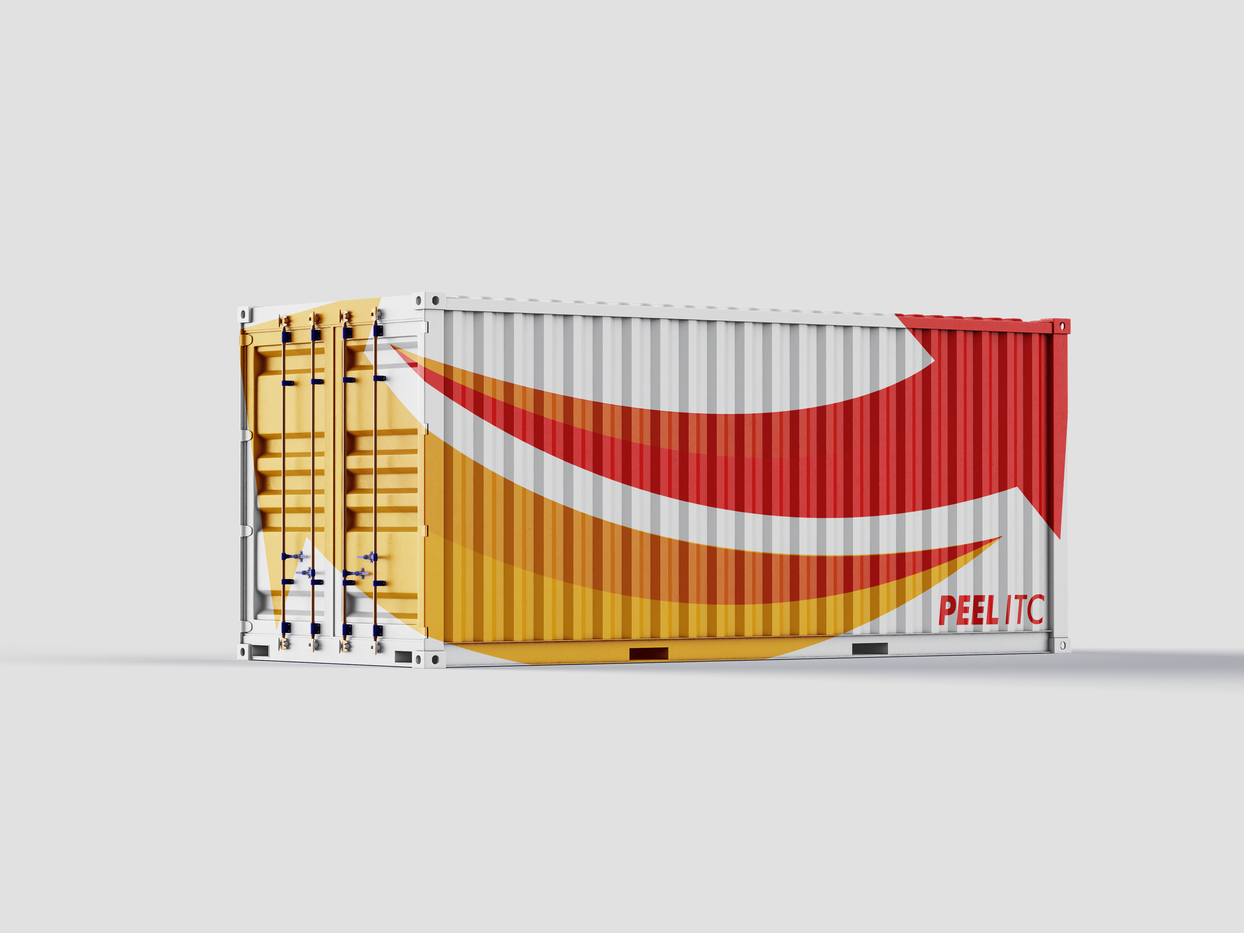
I was hired by Rust Studio in Manchester to produce a new Logo for the new landmark development ‘Peel International Trade Center’. This facility was to allow companies from countries in Asia to exhibit and sell their goods and services into Europe.
‘International Trade Centre at Wirral Waters, Birkenhead. With a total footprint of 250,000m², the exhibition space will accommodate 1,000 trade showrooms for global markets including India, China and South Korea, to exhibit, sell and distribute wholesale goods into the UK, Ireland and mainland Europe.’
Using arrows in the logo to represent several key aspects:
- International Trade: The arrows pointing from Asia to Europe and vice versa illustrate the cross-border exchange of goods and services, highlighting the international trade aspect of the facility.
- Connectivity: The arrows can also symbolize the interconnectedness and seamless flow of business between the two continents facilitated by the facility.
- Progress and Growth: Arrows are often associated with progress and forward movement, which could signify the potential growth and success of companies using the facility to expand their market reach.
- Direction: The arrows can suggest a clear direction and purpose, indicating that the facility provides a focused and effective platform for companies to penetrate the European market.
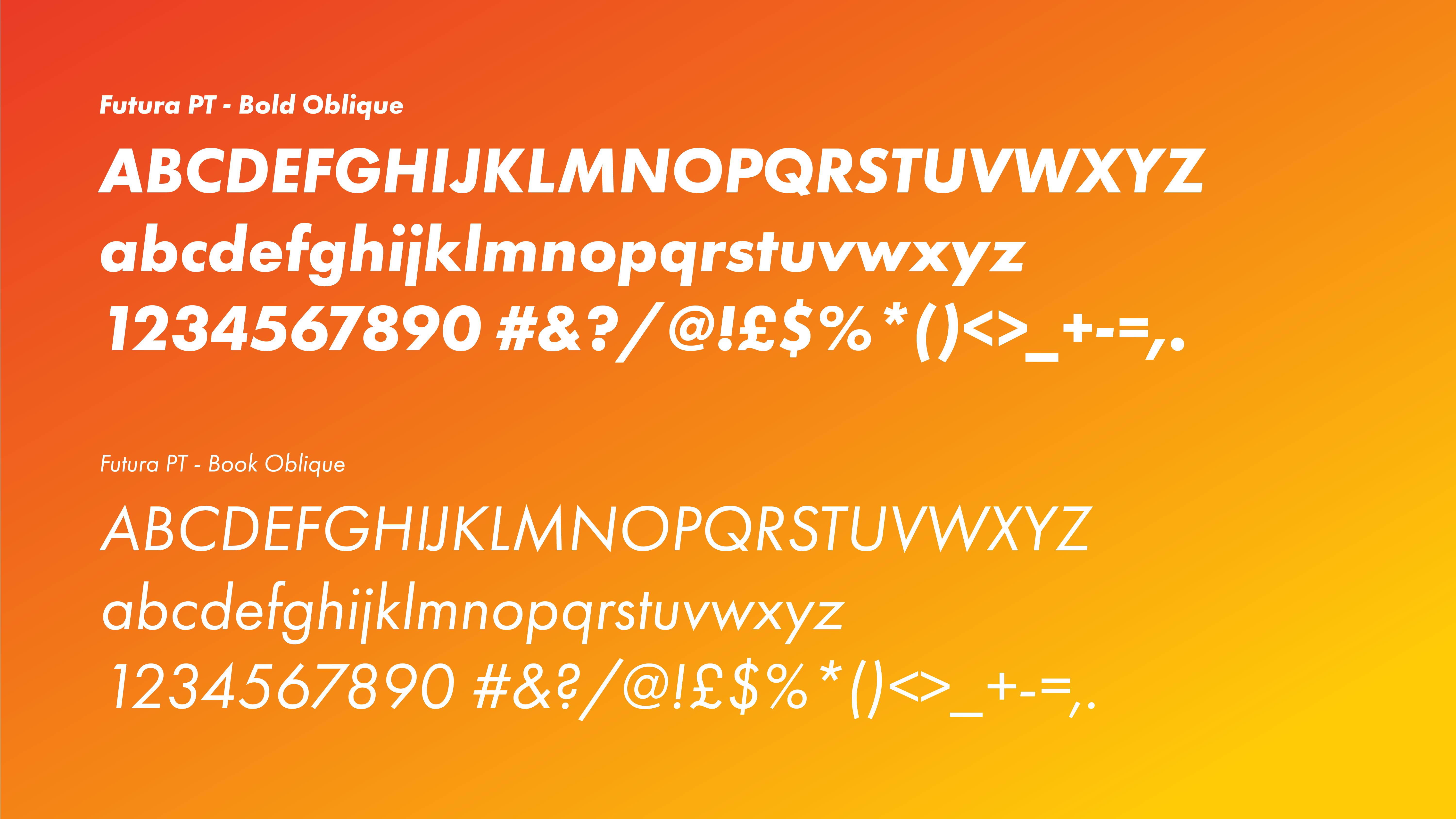
Alternative logo ideas


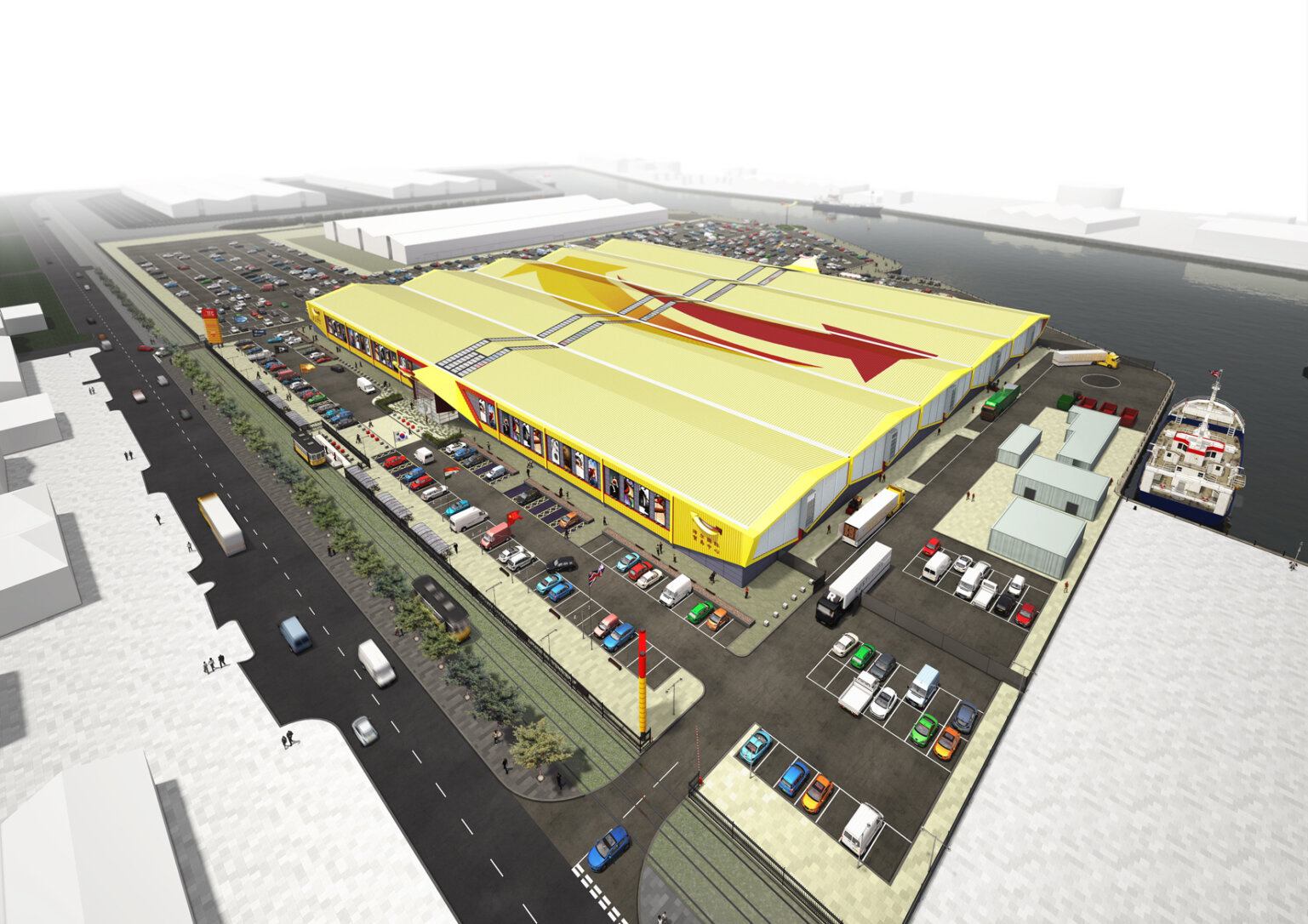


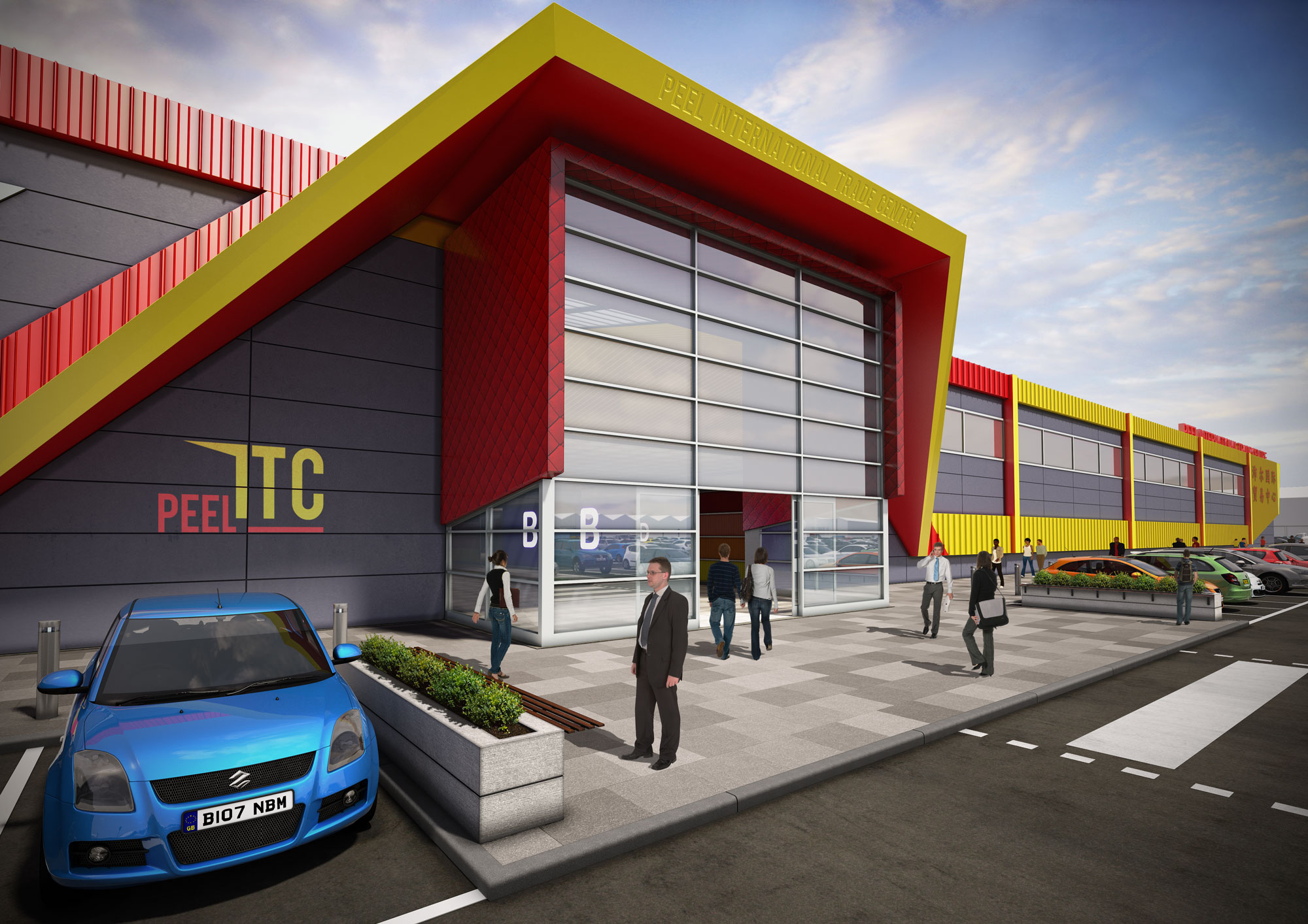
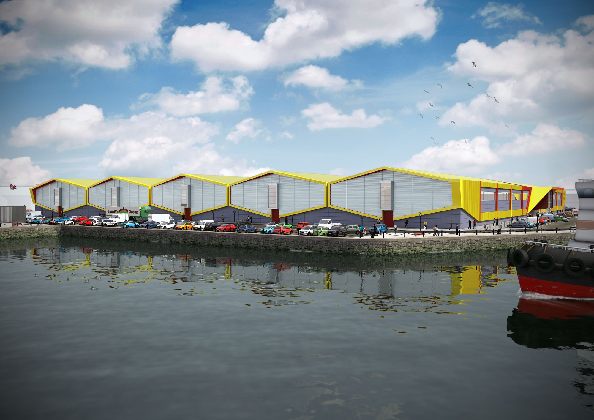
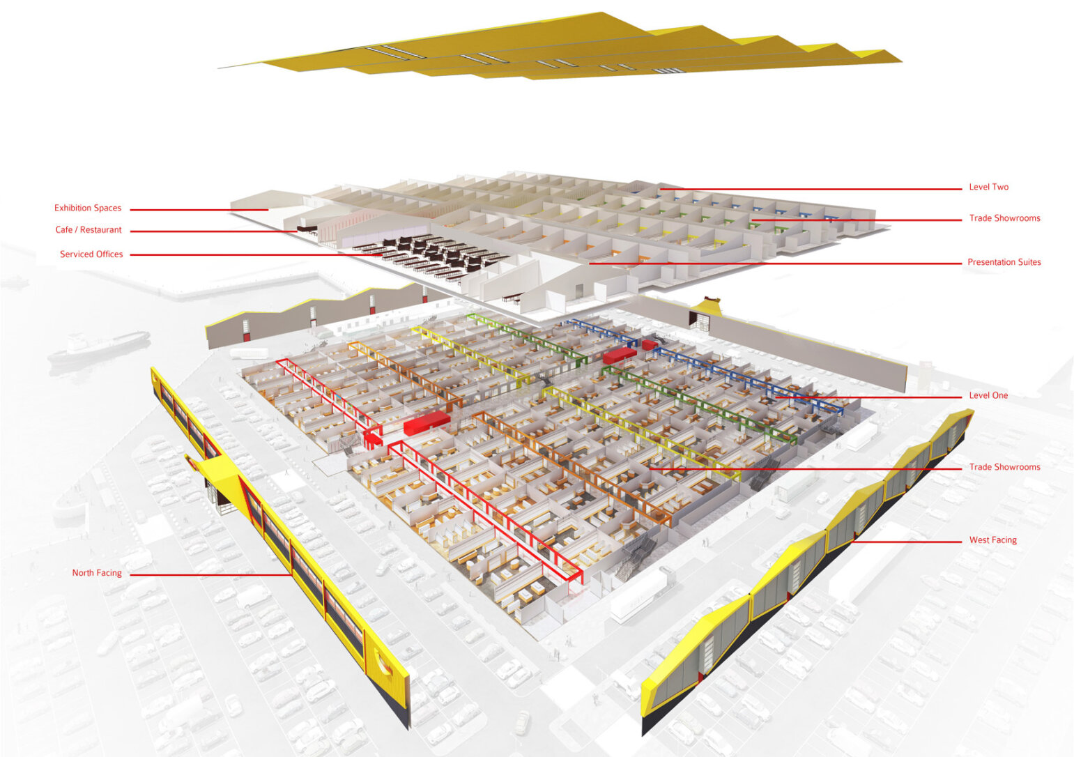
(Building images produced by Rust Studio)